


- How many people visited the website, and how many visitors purchased something?
- How does our sales forecast look?
- What are our most successful referral sources?
- What are customers purchasing from us?
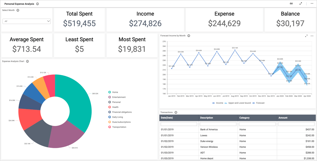
First, it is important to note that this dashboard offers two different filters that are located in the upper right corner. Viewers can view data for a selected date or date range by clicking the calendar icon in the “Select Date” filter. Similarly, they can elect to view data for either all products or specific categories of products using the “Product” filter.
The “Visitors Count,” “Purchasers Count,” and “Forecasted Purchasers Count” widgets offer insight into how the company performed last year and how it is expected to perform this year. Further, the “Forecasted Purchasers Count” spline chart provides additional details by offering a monthly breakdown. This data is invaluable as it could help the company allocate resources—and coordinate customer outreach—appropriately. For example, since sales are expected to decrease significantly in February, the company might wish to launch a promotional campaign in late January.
With the “Visitors to Customers conversion trend” widget, users can analyze a monthly breakdown of the number of website visitors versus purchasers. Again, this information could help the company ensure that employee and marketing resources are used efficiently.
The “Customer acquisition through referrals” pie chart outlines the percentages of purchasers who found the website through various sources. This data could offer insight into the success of the company’s marketing and search engine optimization efforts.
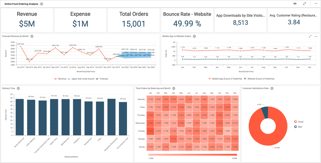
Finally, the “Visitor count by categories” bar chart separates customers’ purchases into five categories: clothing, electronics, foods, home appliances, and sporting goods. However, we can obtain additional details from this widget, as it uses the multilevel drill-down feature. This means that you can click each of the five bars to view more detailed breakdowns of each category. For example, if I click the “Electronics” bar, I can see how many computers, mobile devices, TVs, and watches were purchased. Then, I can click each of these bars to view another breakdown. For instance, if I click “Computer,” I can see how many desktops, laptops, and tablets were purchased. This data could help the company ensure that their inventory and product offerings are meeting customers’ demands.